The Importance of Website Design and Discovery

There is no single way to perform discovery and design for a website. But the point of the process is to:
- Access needs
- Gather requirement
- Understand site users
- Document goals
- Organize the website information
- Predict the way users will interact with the site
- Arrive at the appropriate design style
- Design actual pages and layouts
- Prepare for implementation
What is Website Design and Discovery?
The discovery and design phase of a website project is a planning and design process that takes place before the implementation of the website begins. What are the goals for the site? What emotions
do you want to evoke? What tone will be employed? How will users interact with the site? What kind of design style is appropriate? How you are organizing your team and decision-makers, your timeline, your budget, and your
plans for ongoing maintenance and updates to your site? In today’s world, discovery and design is also about your overall digital customer experience and how the project at hand fits into that larger picture.
Often when an organization desires a new website, there is a temptation to jump straight into visual design. But that is like picking out furniture for a room before you know the dimensions, the flow of traffic, the functions that need to
be accommodated, or the design style you are trying to achieve.
When discovery and design are complete and approvals are in place, then a streamlined implementation can begin.
But is Site Discovery and Design Always Necessary?
The discovery and design processes employed by agencies and web development shops vary widely, from very thorough to nonexistent. Often marketers and even some agencies will minimize the importance of discovery and design phases, assuming that the project
requirements are predictable or “pretty basic”. But it is important that every web development project goes through a discovery and design process to achieve the desired outcomes. And while it may initially feel like the formal process
is adding cost unnecessarily, the upfront discovery and design is almost certainly going to save budget if all stakeholders are fully engaged in the process.
Negating the Value of Discovery and Design
The value of a discovery and design process is dependent on the level of engagement of the stakeholders. Unfortunately, it is not uncommon for some stakeholders to pay inadequate attention to the process until the implementation has begun. Each step of
the process, however, builds on previous steps. Therefore, stakeholder attention at every step is critical, and approvals must be reliable. Stakeholders sometimes think that, because of their timeline, the discovery and design need to be rushed to
get on to the implementation. If the goal is just to move the process along, rather than to fully develop each step, then much of the process will be wasted.
There is always the option of picking a pre-built website design theme
that catches your eye and “making it work” with your content. But if you expect your website to meet the needs of your customers and your team while being part of an overall digital strategy, then a real discovery and design process is
critical and all stakeholders must be engaged throughout the process.
The Discovery and Design Process at Smooth Fusion
Smooth Fusion’s discovery and design process is a culmination of twenty years of experience working with sophisticated brands around the world. Recently, we updated that process to account for the recent evolution in web design and development and
named our proprietary discovery and design process Lodestar™.
The goal of Lodestar is to ensure that the project’s original goals are considered, all stakeholders have a voice, budget and schedule are aligned, and the final design aligns with the brand while honoring the natural constraints of implementing
on the web. The Lodestar process was created for today’s digital experiences and is specifically tailored for building on the Progress Sitefinity CMS platform.
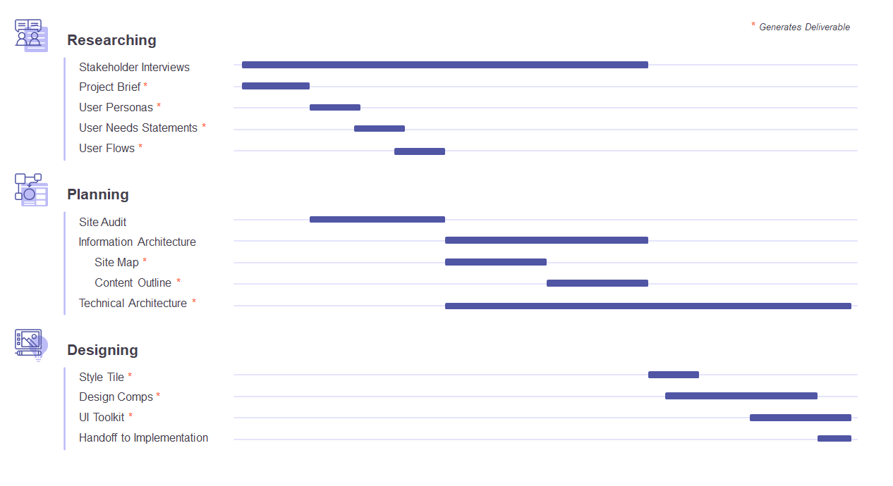
While there are lots of details to the full process, at a high level,
the Lodestar process includes the elements in the Gantt chart below.

Stakeholder Interviews
Stakeholder interviews help us to understand and document project requirements by asking stakeholders exploratory questions that generate discussion around information such as goals, audiences, and how success will be measured. While there will likely be some formal interview sessions, stakeholder interviews are ongoing, often informal, conversations throughout the discovery and design process.
Project Brief
From the very beginning of the process, the compilation of a project brief begins. This is where we document the scope of the coming implementation project, the high-level goals, the people who are involved among all parties, the timeline, budget, milestones, and possible risks. The project brief provides a shared understanding of the project and will evolve through the discovery and design process. The brief also captures the vision and design goals, the audiences, the challenges, and competitors. A project brief is an important tool that gets all stakeholders on the same page and informs every other element of discovery and design.
User Flows
When necessary, complex user experiences or processes will be visually documented into user flow diagrams. These help stakeholders visualize any multi-step user interactions or complex processes that must be handled and help ensure that every step has been accounted for.
Information Architecture
Users come to a website for information or to interact with your organization in some fashion. A website is not very useful without a plan for organizing the content of the site. And the larger a website is, the bigger the mess if there is no architecture
for the information. To achieve a good user experience, decisions must be made regarding how the information will be organized and presented. It is not enough to have information on the site. Your users need to be able to find what they need and understand
what they find. And if there are tasks to complete, the information required for the user to complete the tasks can be the difference between a frustrating user experience and a great user experience.
Often, a content audit is conducted
on the website being replaced. This ensures that nothing is overlooked, including content that may be seasonal or obscure.
The information architecture also includes the creation of a sitemap and a content inventory. A sitemap visually
documents the site’s pages with an emphasis on the hierarchy of those pages. Once a sitemap is created, the navigational structure can be outlined so that we define how users will get from one page to another. A content inventory is a high-level
list of content to be included on the site. It is not necessarily word-for-word content, but it does have enough information to allow the content to be organized and to anticipate the amount and types of content.
Technical Architecture Document
The architecture document includes relevant technical requirements and integrations for which the solution calls. Examples include definitions of forms needed on the site and how data collected will be handled or custom modules that need to be designed and implemented.
Style Tile
The style tile is an intermediate step between the direction and documentation gathered in the previous steps and the design comps that are coming. The style tile saves budget and time by capturing the right identity and emotions before moving on to generating the design comps. In this step, the look, colors, style, and fonts are selected that will be used in the comps.
Design Comps
The term “comp” is short for comprehensive layout. A comp is intended to show everything a user can expect to see on a single interface or page. At this stage, we use design blocks that are based on the Bootstrap Library to generate comps that have the look, colors, and fonts from the style tile. Through this process, site implementation is considered during design, which saves on budget during the site build. At this stage, we focus on the home page and one or two subpages in order to quickly move into client approvals. Comps of other pages may be generated after the client approves the initial pages.
The Smooth Fusion team works with client stakeholders to ensure that the comps represent the brand, meet the project goals, and has an intuitive interface.
Creating a UI Toolkit
Once comps are approved, we create a design system that gives marketers and website content managers a UI toolkit that includes styles, components, and structures, and serves as a guide for software developers and for content managers when building and maintaining pages. The UI toolkit also includes our standard library of design blocks as well as any custom design blocks that your project requires. At that point, you have a complete library of design blocks reflecting your custom style, colors, and fonts that allow for rapid web page development in Sitefinity.
Discovery and Design for Sitefinity Websites
Progress Sitefinity CMS is a powerful content management system that is made even more powerful when used in conjunction with a formal discovery and design process. For example, page building is simplified for marketers and content managers when proper planning and design have been employed. But even more importantly, features like personalization are made more effective when informed by proper discovery and design.
We encourage you to read our blog post on best practices for Sitefinity page building to see the payoff of a well-planned design. We also encourage you to explore these related blog posts:


