Creating Great Bio Pages on Your Bank’s Website

Keeping the Community Feel in Your Digital Banking Experiences
Digitalization in banking is no longer “emerging.” It is here. Community financial institutions have jumped right into the frenzy of creating digital experiences to address the decrease in customers coming into branch locations over the past few years.
However, with this focus on digitizing customer interactions, it seems like many community banks have forgotten what makes community banking so special – the people. One of the main reasons people choose to bank locally is the personal relationship they develop with their bank or credit union.
How then, do you bridge the gap between the digitalization that your customers want while also giving them the personal connection they expect?
The answer is to not refrain from continuing to push for unique digital solutions but to utilize these solutions to help set community banks and credit unions apart.
With your website being a huge part of your public image, you need to find a way to provide a great digital experience while also making that interaction personal.
One way to do this is by focusing on what sets you apart as a community financial institution, your people. A great way to highlight your people is with great bio pages.
Bio pages are ranked as one of the most frequently visited pages across the banking industry, which is even more of a reason why focusing on making them engaging is worth the time investment.
In this article, we will provide some practical tips on how to build bio pages that effectively highlight your personnel so that your website and digital efforts become a source of connection with your community.
Why Start With Bio Pages?
There are many ways to give a more personal feel to your website. Personalizing content is one way and although it is necessary, it won’t help you stand out from the mega banks.
Your people are known in the community your bank serves, which is something the big banks can’t say.
You can take advantage of this is by creating bio pages that capture the community feel and highlight your people in way that connects them with those visiting your site.
The Most Important Pieces of a Great Bio Page
Start with a Great Photo
Nothing says “personal” more than a photo of a real person. Ditch the canned professional pictures with the dull brown or blue background and embrace a more natural (yet still professional) look outdoors or in front of your logo. (Tip: Shooting pictures outdoors will also dramatically enhance the lighting in the photo.)
Always try to aim for a more natural look, your site visitors will appreciate seeing real people.
It’s also important to pick a good day for your people to have photos taken. Surprising your employees isn't a good idea. Instead, reach out at least a week in advance and offer options for picture days. And if you are planning outdoor photos, take the weather into consideration.
It’s also important to let them know what they should wear. In headshots, wearing neutral colors instead of bold colors and patterns is the way to go. Chances are your employees already dress to impress, so you're probably safe telling them to come to their photoshoot as they dress on any normal day at the bank. But it’s always important to remember this is going to be on your public-facing website so give your site visitors a good first impression.
Get Personal with the Bio Itself
Have you read the professional bio of someone who speaks only of their experience in the industry, schooling, accomplishments, and professional success? While knowledge of that professional information may be helpful in generating some trust in the company, it does not make your site visitors feel connected to you as a person.
Make sure that bios are personal and emphasize community involvement. The display of professional accolades is necessary and builds trust, but knowing a banker enjoys a good BBQ with their family, loves mountain biking at the local park, and volunteers at a local charity are equally needed. This kind of bio develops warm feelings and forms a unique connection that begins the personal relationship you want with your customers and members, even if you never actually meet in person. Be specific and identify places your visitors will know –name the park where your banker bikes or the charity where they volunteer.
Include Accurate Contact Info and Convenient Contact Methods
This may seem obvious, but be sure to include accurate contact information, and do it in a way that adds convenience for your customer and member.
Be sure to allow for mobile “tap to call” on the phone number listing and add a map near the address that is connected to a GPS interface that your customer or member can use when traveling to a branch location.
Add Links for Meeting Scheduling and Provide Video Conferencing Options
Scheduling meetings with someone online is incredibly easy with tools such as Calendly, which link directly to your organization’s calendars and lets customers and members choose available times that work best for them.
We encourage having links to schedule meetings with your people as visible as any call to action would be. It will help show that your bankers are willing to meet and happy to help guide prospective customers and members through any of the services you offer. And in the spirit of offering convenient digital solutions, adding the ability to schedule meetings via video conferencing is always a good idea.
Sync a Product with Your Bios… And Remember the CTA to Apply!
Is the person in the bio a mortgage lender? Outline some “next steps” underneath the bio to ensure that your prospect goes from learning about who their lender is to learning how to move forward in the mortgage process with that lender.
Include details about what documentation to gather for the process and anything else that may make the transaction more seamless. Also make sure they see everything they need, like the call to action to “Get Started” which links to your online application platform.
Utilize a People Module that Brings it All Together
Adding all the above elements is essential but being able to do this easily makes crafting a great bio page even better. Modules are components that are common across websites, and they provide content editors with an easy way to add content to a page without having to build from scratch.
A good people module gives editors the ability to simply drag and drop onto a page and input content that then displays the content in a consistent style.
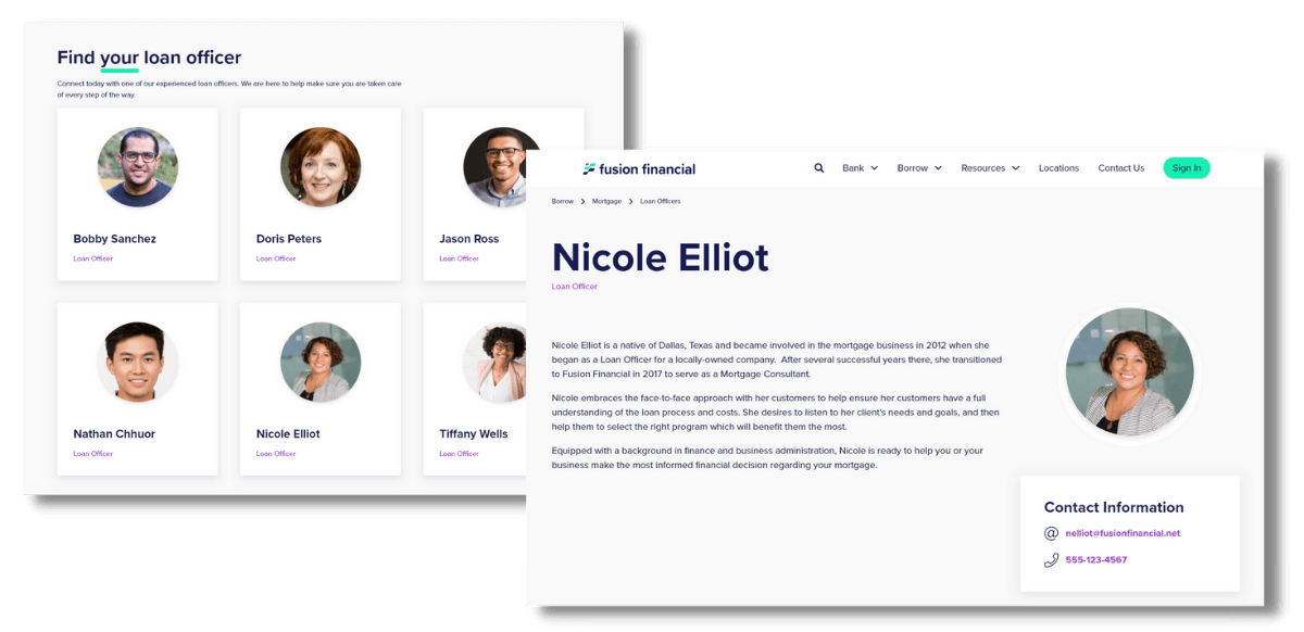
Here are a few examples of what a people module looks like from DXFusion Financial, our DXP for banks and credit unions.


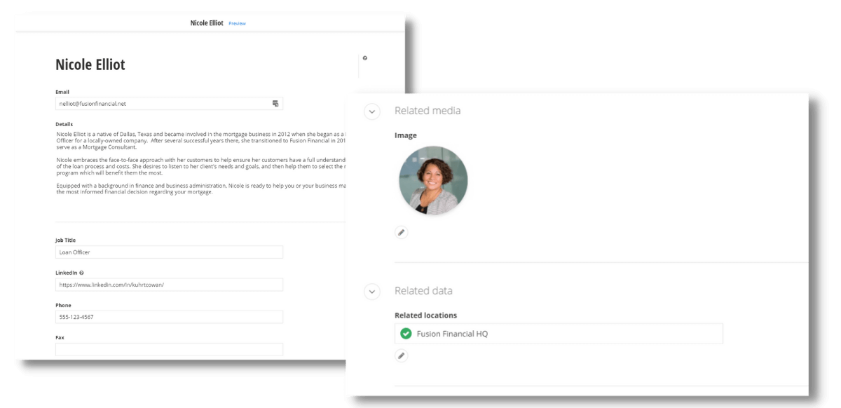
The people module in DXFusion Financial gives content editors a way to simply add and manage employees in the backend content management system without having to worry about consistent styling or formatting on the front-end.
A people module like this makes it easy to add a new person or manage/make edits to existing employee information on your site. Adding content through a module works by filling out form fields like name, job title, contact info, and associated branch location - then once published your new employee is automatically added in a pre-defined format and styling on your public-facing site.
Your Community Bank's Digital Success is Achieved with Personal Experiences
Ensuring that you make your digital presence personal is vital to the success of community banks and credit unions. There is no better way to start than by making sure your people are highlighted in a way that connects them to your community.
If you are looking for more ideas about providing personal experiences on your website then check out a recent post on ‘Website Personalization and Financial Institutions. If you ever have specific questions then reach out to us.


