Responsive Design for the Future - Part 3 of 3


In Part 3 of our series, you will learn how utilizing a responsive design can enhance a user’s experience and serve as an effective tool for marketers. In addition, we’ll uncover when it makes the most sense to use a separate mobile site or native app.
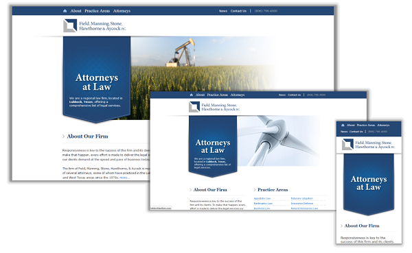
Now that you’re familiar with responsive design, you know that content on a website is rearranged and resized to adapt to different screen sizes. Since the same content is used, the look and feel of your site will remain constant across all platforms regardless of the screen size or device. Marketers can now ensure a consistent brand experience across all devices. Your users will also thank you for the seamless user-friendly experience.
Consistent Branding Across All Devices Using Responsive Design
In Part 1, we mentioned that there are several aspects to consider before deciding on responsive design. Every business and situation is different, so you’ll also want to consider whether or not a native app or a mobile site is the better option.
The most important factor to consider is content. What content or information is a mobile user looking for when they access your site on the go? Are they looking for different information than what is provided on your desktop site? A mobile optimized version can cater specifically to mobile user’s needs and keep you from developing a completely new site.
Are you really in need of a native app? Native apps can be very costly to initially develop, and will require additional cost for maintenance down the road. If you do have the budget, you’ll need to keep in mind that a native app is written specifically for operating systems. This could mean that two or even three versions of the app will need to be developed to target most of the devices on the market today. These apps will also be utilizing app stores as a middle man for downloading. The most common downloaded apps involve frequently updated content that users will be accessing on a very consistent basis. Apps that deliver information such as news, weather, banking, sports, music, entertainment, and a user’s specific hobbies will be at the top of this list.
What if you’re set on the benefits of responsive design, but you need to deliver slightly different content to different screen sizes? Innovative methods of development can be used to solve the issue of adding or dropping certain features between break points, or screen sizes. This is known as progressive enhancement. Using progressive enhancement in your responsive design can be challenging, but will allow you to tailor the content of your site to specifically fit the needs of users on different devices.
Smooth Fusion is custom web and mobile development company and leading Progress Sitefinity CMS Partner. We create functional, usable, secure, and elegant software while striving to make the process painless for our customers. We offer a set of core services that we’ve adapted and refined for more than 250 clients over our 17 years in business. We’ve completed more than 1700 projects across dozens of industries. To talk to us about your project or review our portfolio, send us a message and one of our project managers will reach out to you quickly.