Responsive Design for the Future - Part 1 of 3


With the constant hype surrounding the release of new mobile devices, we thought it might be time to bring up one of our favorite topics here at Smooth Fusion – responsive design. Over this three-part series you’ll learn what you should know about responsive design; its pros and cons, how it is useful today, and why it will be significant for many years to come.
A Pew Research Center study found that 31% of adult U.S. mobile Web users say they now go online mostly through their mobile phones. Some project that by 2014, mobile Internet users will be more numerous than desktop users. It is clear that having mobile-friendly sites are no longer optional for those who wish to reach the Internet users of today and tomorrow.
Today’s mobile user requires fast, easy-to-access information on the go. This means they expect your site to load in seconds and be able to find what they need in just a few swipes or clicks. They don’t want to zoom in to read small text or swipe thirty times to find valuable information.
At Smooth Fusion, we often recommend responsive design to provide the greatest adaptability to the many screens that are inevitably displaying your site. Simply put, responsive design creates a single site which will adapt to the many screen sizes on the market today. A great way to see the adaptability – or “response” – of a responsive site is to simply resize your browser to mimic the size of a smartphone, e-reader, tablet, and desktop.
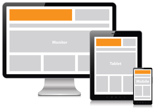
You should notice three or more breaking points, allowing the site to effortlessly adjust itself to create a more user-friendly layout. When executed correctly, responsive design will optimize your site so the content has tailored layouts for each and every device used to access it, as well as create an “app-like” experience for smartphones and tablets.
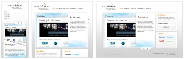
On the Smooth Fusion site (shown below), the same content appears on desktops, tablets, and phones. But as you can see, the content is rearranged and resized as the available space shrinks. By the time the browser shrinks to phone size, the navigation changes to a stacked menu layout.
We can all agree that the mobile market is booming and it’s time to adapt to the mobile world. Our clients know this, but they often default to requesting a native app. Building the app of their dreams is not always the best business decision – even if they have the budget. Responsive design strategies can eliminate the need for a native app and offer significant savings of time, energy and money. There are several aspects to consider before making this big decision, and every case is different, but we suggest you at least consider a responsive approach.
In Part 2 of our series, we’ll go in depth to address the technical details and design challenges of responsive design. In Part 3, you will learn how utilizing a responsive design can enhance a user's experience and serve as an effective tool for marketers.
Smooth Fusion is custom web and mobile development company and leading Progress Sitefinity CMS Partner. We create functional, usable, secure, and elegant software while striving to make the process painless for our customers. We offer a set of core services that we’ve adapted and refined for more than 250 clients over our 17 years in business. We’ve completed more than 1700 projects across dozens of industries. To talk to us about your project or review our portfolio, send us a message and one of our project managers will reach out to you quickly.