
Responsive Design for the Future - Part 2 of 3


In Part 2 of our series, we’ll reveal the benefits and certain drawbacks of responsive design along with the design challenges that are involved.
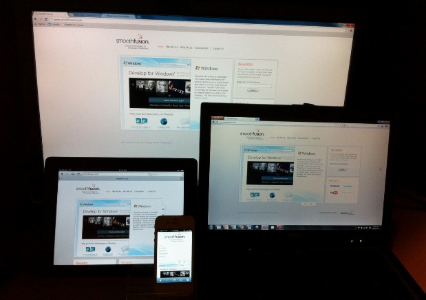
Responsive design is the most flexible way to address the many screen sizes on the market today. When implemented correctly, a responsively designed site can be effective on practically all screen sizes, in both portrait and landscape orientations.
One of the primary benefits of utilizing a responsive design is its need for only one code base. In other words, utilizing a site built this way can eliminate the need to develop a separate mobile site or even build a native app – both of which require the use of additional time, resources and money.
Savings can also be seen when performing maintenance and updates on the site. Changes can be made in one place unlike having two sets of code for desktop and mobile. Once you publish those changes, the updates will conveniently be seen immediately across all devices – pretty cool stuff.
Your site’s web presence will also benefit from having one set of code. The site will live on one URL with one site path, allowing you to focus your search engine optimization (SEO) efforts. Additionally, the use of a single site path eliminates the need for site redirects, allowing mobile users to easily navigate between pages. Keep in mind that native apps aren’t accessible through a search engine, so a site that caters to both desktop computers and mobile devices is ideal for SEO. Search engines favor responsive design over having a desktop and mobile version with repetitive content. For instance, Google favors a single URL because it helps their algorithms assign indexing properties to your content. Bing is also in favor of responsive sites and even states that, “redirection to alternative URLs for mobile content…is not the approach we recommend for best SEO results.”
Despite the many advantages of utilizing responsive design, slower loading times can be a considerable drawback. The same images and graphics that are used in a desktop design are also loaded on mobile devices. Where a mobile site may be able to load smaller images and omit certain features or content, a responsive design site will potentially load larger images and content which can affect the speed.
Well-executed responsive design can load smaller graphics first, then conditionally load larger graphics if the browser is large enough. If this is done correctly, the effect on loading times can be mitigated and the site can deliver a speedy mobile experience.
In Part 3 of our series, we will uncover the enhanced user experience that responsive design can offer your site, and discuss times when a separate mobile site or native app makes sense.
Smooth Fusion is custom web and mobile development company and leading Progress Sitefinity CMS Partner. We create functional, usable, secure, and elegant software while striving to make the process painless for our customers. We offer a set of core services that we’ve adapted and refined for more than 250 clients over our 17 years in business. We’ve completed more than 1700 projects across dozens of industries. To talk to us about your project or review our portfolio, send us a message and one of our project managers will reach out to you quickly.